Sinful Serenade is my favorite series, now and forever. It’s the first thing I wrote that I loved that other people loved too. I filled Sing Your Heart Out with all my high school musician crush feelings… the ones I still have (though not as strongly, if I’m being totally honest… it’s been eight years and I’ve matured and moved on to some degree, and that particularly lyricist is just sorta a has been now. Sorry! That one album is still my favorite though.)
(Editor’s note: Crystal’s Spotify play history does not align with the claim she has moved on).
Over eight years, the Sinful Serenade series has had a bunch of different covers! It’s been so much fun presenting the series in new ways. And here they are.
First, a note about covers: I’m a reader first. As a reader, I love a beautiful, unique cover. I prefer something unusual to something typical. As an author, I’m both an artist and a publisher. My artistic side wants a beautiful, special cover, because my books are beautiful and special! But my publisher side knows I need to reel it in: the cover can be beautiful and special… if it also signals the right things. Covers are “signals” and they need to contain A LOT of information: the genre of the book (romance), as well as the subgenre (in this case, new adult and rock star), the heat level (scorching), and the tone (a mix of humor and emotion). There’s a lot of other stuff I want to signal, but some of it is just hard to say visually!
As a reader, I totally get the hatred of a new cover… how dare an author change from the cover I loved! But as an author, I know it’s a necessary part of the job (an evil if you see it that way, or a fun experiment if you see it that way… and I do. I love trying new things!) Because I need to give the series a fresh look from time to time, in order to bring in new readers, so I can keep writing books. (and have a chance at returning to the world… because if no one wants to read a series anymore, there’s no reason to write a spin-off or a next gen or anything similar).
The Original Covers:
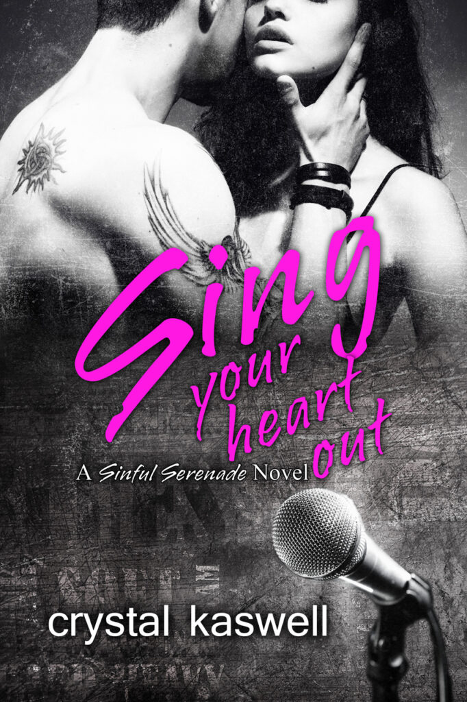
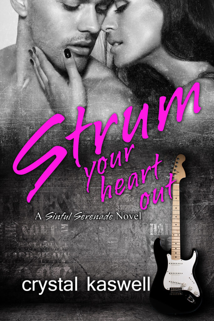



Way back when, in 2015, I had very little idea what made a cover sell. But I had a few things to go on: sexy couples and musical instruments. I tried to hire a designer for a sexy couple and she made a nice cover, but it just didn’t say rock star, or feel exciting. So I searched far and wide, looking at “premade covers” everywhere. (A premade is a cover a designer has already created, which an author can buy, and make minor changes too–title & name of course, and sometimes some colors and fonts. The “typical” cover process is a custom cover, where an author brings a prompt to a designer, and she crafts a beautiful cover based on the author’s instructions. It’s a collaborative process, where, ideally, the designer brings a great mix of creativity and market knowledge, so the author has a cover they love that also tells readers “this is the kind of book you like”).
These are my favorite covers! I absolutely love them. The greyscale, the musical instruments, the fun pink font! Amazing! At one point, I did change these covers… I asked my designer to make my name bigger, so I looked like a bigger deal. (Later, I switched my name to my new branding, the one on my Inked Hearts Covers). For a long time, these covers did really well. But the look started to fade… between the fonts, the gritty texture, and the greyscale, these started to say 2016 in a bad way. And this sort of cover started to appear more and more on books featuring “alphaholes” and “bullies” and general “dark romance” sorta vibes. The covers no longer said FUN AND PLAYFUL because so many other books with similar covers said MEAN DUDES ONLY. And since I can only control myself, not other authors, I decided to change my covers.
The Second Try:
These were by Sarah Hansen at Okay Creations, the designer who created my Inked Hearts covers. I asked her to create some covers that looked a little more modern, covers that would signal “these books are just like the Inked Hearts books you love so much.” We struggled with the color scheme–the initial look she tried was way too pastel–but the final covers turned out great. They sold well to Inked Hearts fans and a lot of new readers fell in love with Miles, Drew, Tom, and Pete all over again.


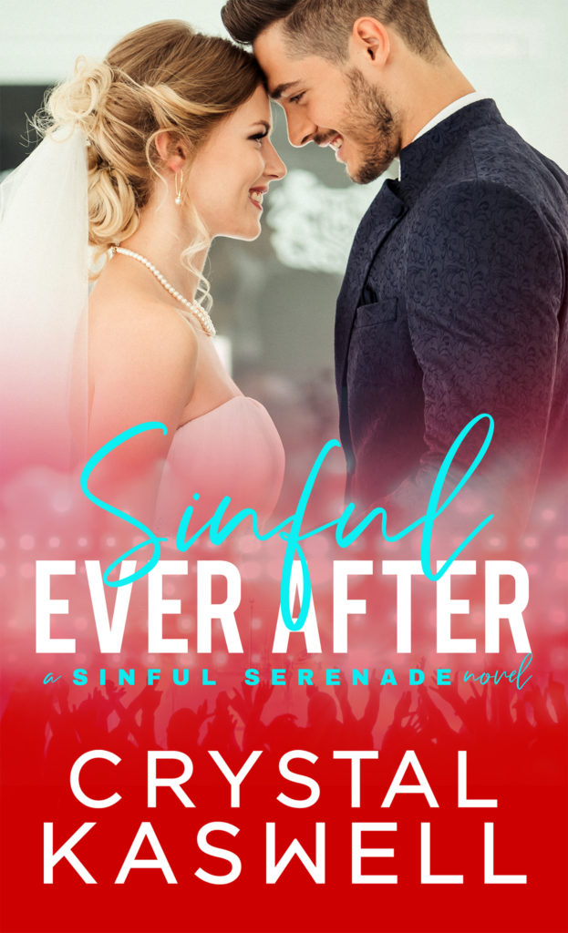
Take Three: The Guys
A long, long time ago, I decided to write an alt POV version of Sing Your Heart Out, mostly from Miles’s POV. This book, called Just a Taste, did not sell particularly well. A lot of Sinful fans loved it but that was about it. Oh well! So it goes with our author experiments. I had a lot of fun writing the book. In hindsight, I would have written the entire thing from Miles’s POV, replaced less scenes, added more new ones. But I love the book as it is. (At the time, I felt Meg’s POV was necessary for context in a few scenes). I wanted to try a totally different look for this cover, one that said “dive into the head of this damaged dude” rather than “rock star” or even “schmexy couple” so I tried a style of cover that rarely works for me… a solo guy.
I know, I know… so many readers love sexy dudes, but, for some reason, I just don’t know what it is they love. I pick the wrong guy or the wrong image. These covers just don’t usually do well for me. They don’t speak to me and maybe that’s why. I hate to admit this to you, but I find images of men sorta boring.
With this new book, I retitled my Sinful Serenade prequel, Sing for Me, to call it Just a Tease.
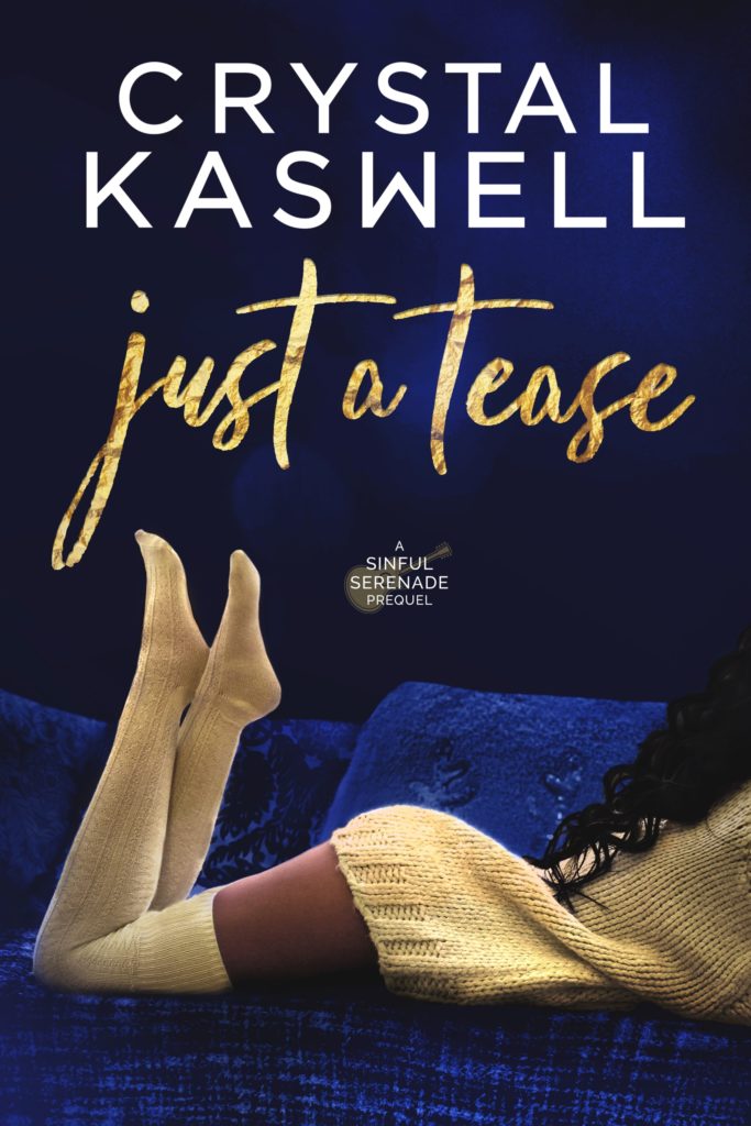
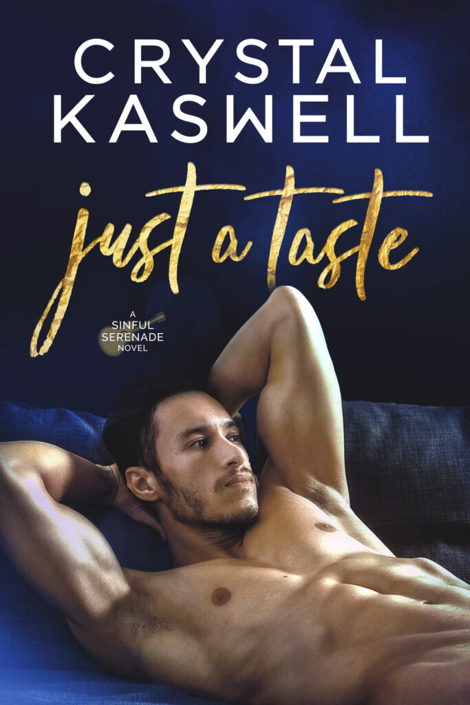
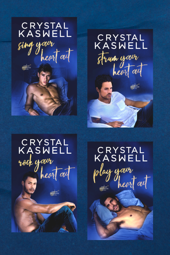
This cover did all right and readers enjoyed it. I loved the model’s brooding look and suggestive pose. And when I started working with a new ad person, she loved it too. She convinced me to recover the book with this concept, but I never really *loved* the look. They did okay with Facebook ads, but it turned out they were too sexy for AMS (Amazon’s internal ads). AMS really hates horizontal images.
I tried a few things with these and they did okay, but never well enough to justify spending more money on ads. Plus, they didn’t really match up with the Dangerous Noise covers. So, eventually, I switched back to the pervious covers.
The Illustrated Edition
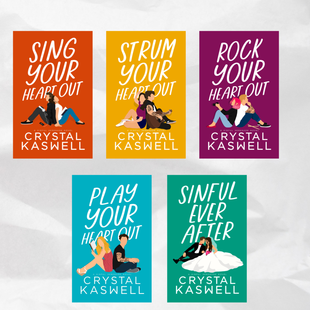
My Inked Hearts spin-off series Inked Love never really took off. It did okay. I tried all sorts of covers. Men (but the were horizontal… since that was the concept, and that meant ad troubles). Couples that matched Inked Hearts. Ladies. The ladies performed the best but they still didn’t knock it out of the park. So, on a whim, I tried illustrated covers and I LOVED them. They did really well with AMS (and the new kid on the scene… TikTok) and I thought they were so much fun. So I tried them for Sinful Serenade. To be honest, I wanted to do something more typography/object based, but it just wasn’t happening with my designer, so we ended up with these really cute figures.
To be honest, again… I have been expecting negative reviews on these books. The covers are cute. I get that they say cute (and I get if some people find them twee). But so far, I’ve had really positive feedback. Even though these books are angsty and smutty as hell.
I don’t expect to keep these up forever, but for now, I love them. Along with the change in covers, I updated the new paperbacks so the vectors better reflect the heroine’s journey (rather than the hero’s instrument). It’s something that’s important to me after so much time in romance: I always want my heroines and their journey to take center stage. (Or at least get equal weight).
I know this isn’t a popular opinion, but I love the new look of the covers! As a mom of 3, whose kindle book covers pop up on my kids’ devices no matter what settings I change (other than restricting books completely, which would be counterproductive 😂), I truly appreciate the non-sexy covers. This way I can read my favorite books without worrying about my kids 🤷🏼♀️😂 I wish Amazon would let people pick which cover to display 💜
Thanks so much! A lot of people love the covers, actually. (And they have done reasonably well in the sales department). It’s just people who don’t like them like to complain more. I totally agree. I like to look at a sexy cover, but I don’t want to flash it to other people. Not ’cause I’m embarrassed but ’cause I don’t want to flash sexy images to people who might not want to see them at any particular moment.